Client — SAICHO
Field — Visual identity & Packaging
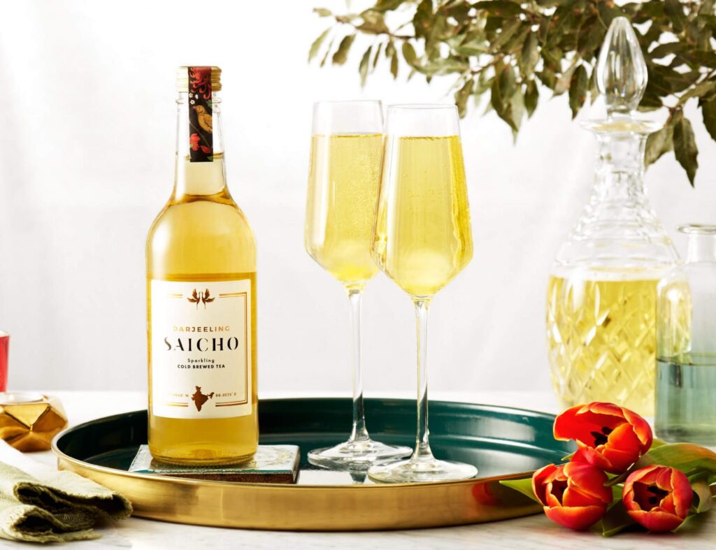
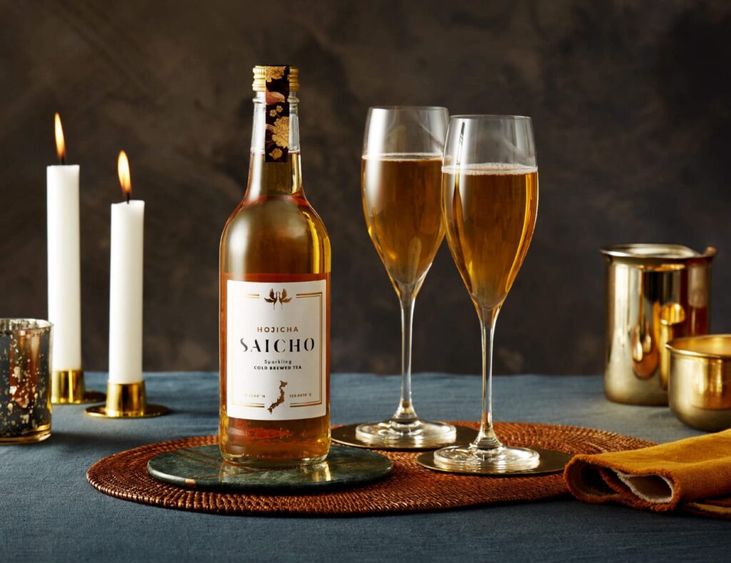
Crafted by fusing cold-brewed tea with eastern-inspired ingredients, Saicho has a unique infusion of flavours, perfect for fine dining.


A name from heritage
I wanted to create a name for this brand that captured the essence of the ingredients. I discovered stories of a priest named Saichō, who exported the first batch of tea seeds to Japan in the year 805.
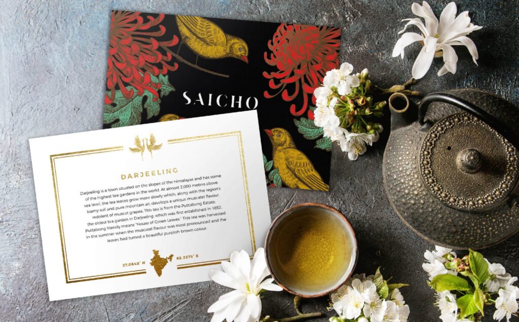
A fitting logo for a new drinks brand
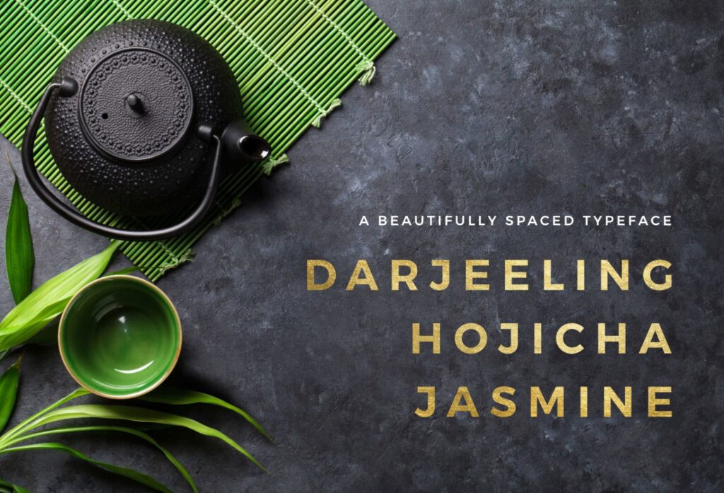
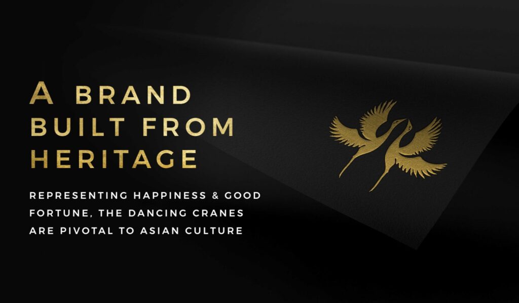
The logotype exhibits the delicacy of brushstrokes used in Eastern culture to add a unique feel to the brand, while two cranes symbolise good fortune and happiness.
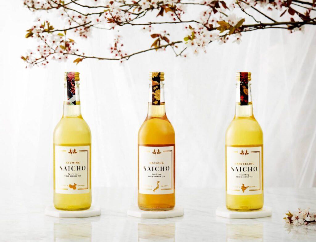
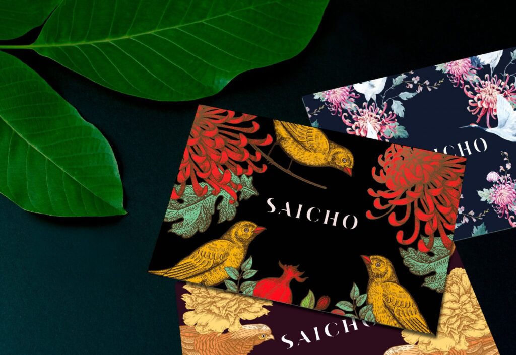
Adding eastern drama
Dark and colourful illustrations create a rich sense of drama, while the patterned styling links to an Eastern heritage. In addition, I created a bespoke emblem: two cranes in perfect symmetry, symbolising good fortune and happiness.
