Client — The Quadrant
Field — Visual identity
The Quadrant is a community-focused hub for work and play. From meeting rooms, studios, gym and cafe, The Quadrant encourages people to embrace a positive work-life balance.


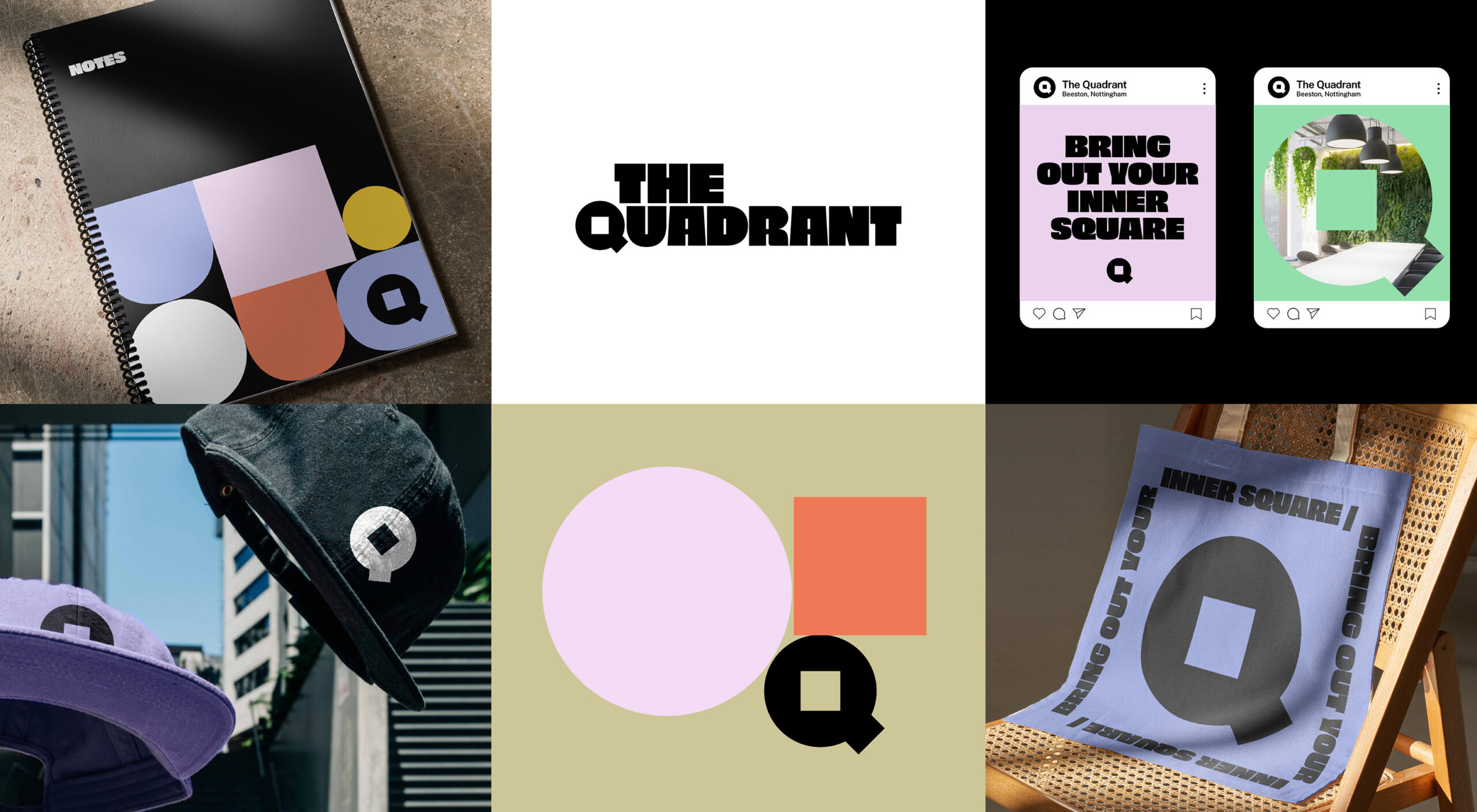
An iconic ‘Q’
A bold icon mark takes the focus throughout this identity. The Quadrant ‘Q’ has a huge flex when applying colour and imagery. The Q is a key element, not just throughout the identity, but it directly links to the iconic square window you walk beneath when you enter the building.


The Quads
The logo was created from three shapes – a circle, a square and an arc. These are collectively known as the ‘Quads’ and are used throughout the identity to create a bespoke brand that reflects the different shapes and spaces at The Quadrant. This forms a strong and unique cohesion between the logo and identity and reflects a positive and quirky tone that brings contagious energy.
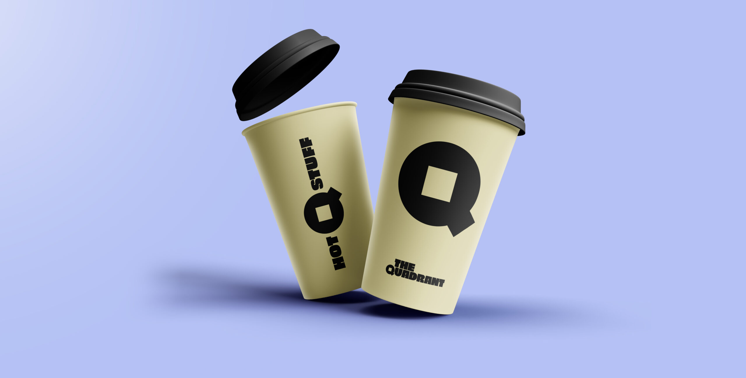


‘Obviously’ the right typeface
This typeface is central to The Quadrant identity. ‘Obviously’ is bold, characterful and confidence-inducing. The characters have uniquely quirky qualities that blend perfectly with the feel and tone of this identity.


Behind the colour
The colour palette for this identity has been carefully selected to appeal to a wide range of customers. With each colour bringing its own flavour, this identity has the ability to be toned-up or toned-down, while remaining on-brand. The two primary colours, purple and black, fuse to create a unique feel. The calming vibe of the purple alongside the edgy black form a bespoke tone to the overall identity.