Client — Little Pips Nursery
Field — Visual identity
Little Pips is a new nursery for children aged 0-4, backed by the esteemed Pocklington School. Rooted in the Reggio Emilia approach, it offers an expert-led environment where children are nurtured as individuals. With highly trained staff and a commitment to safeguarding, it provides an exceptional foundation for early learning.




The Little Pips difference
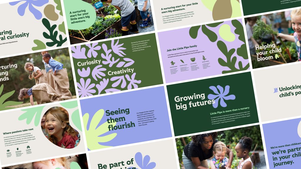
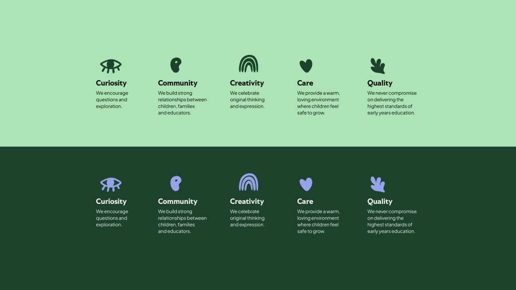
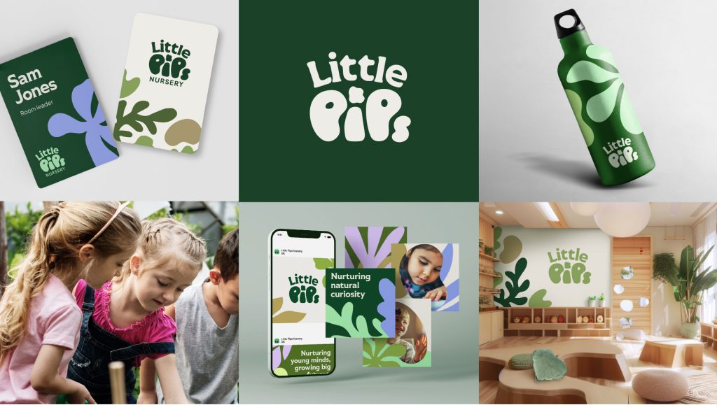
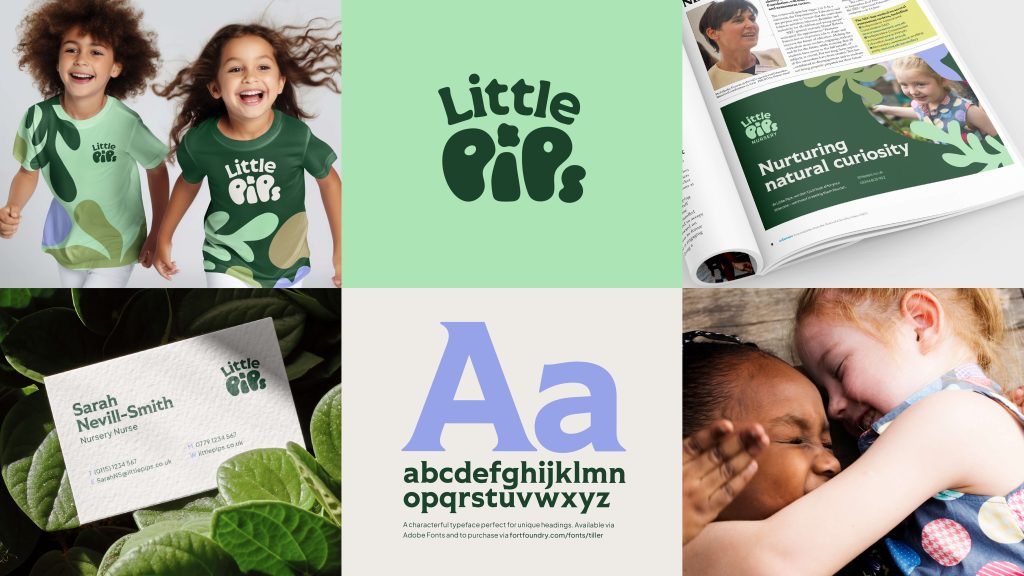
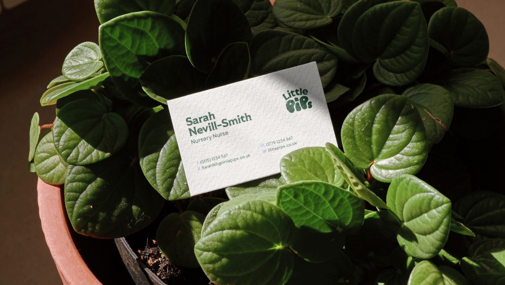
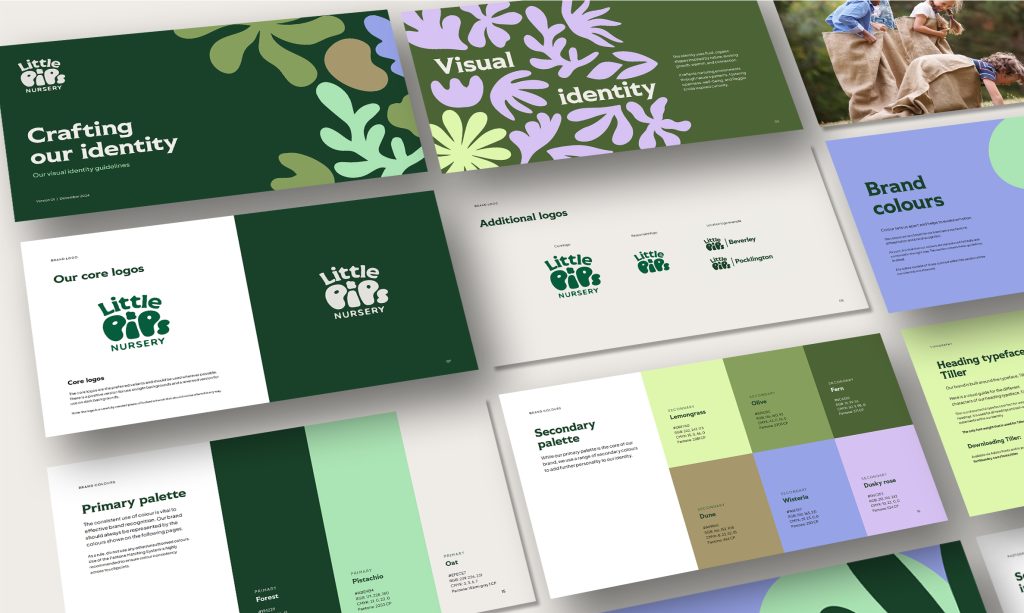
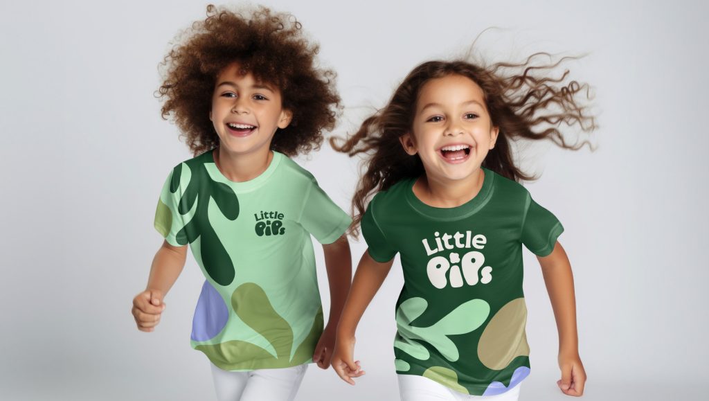
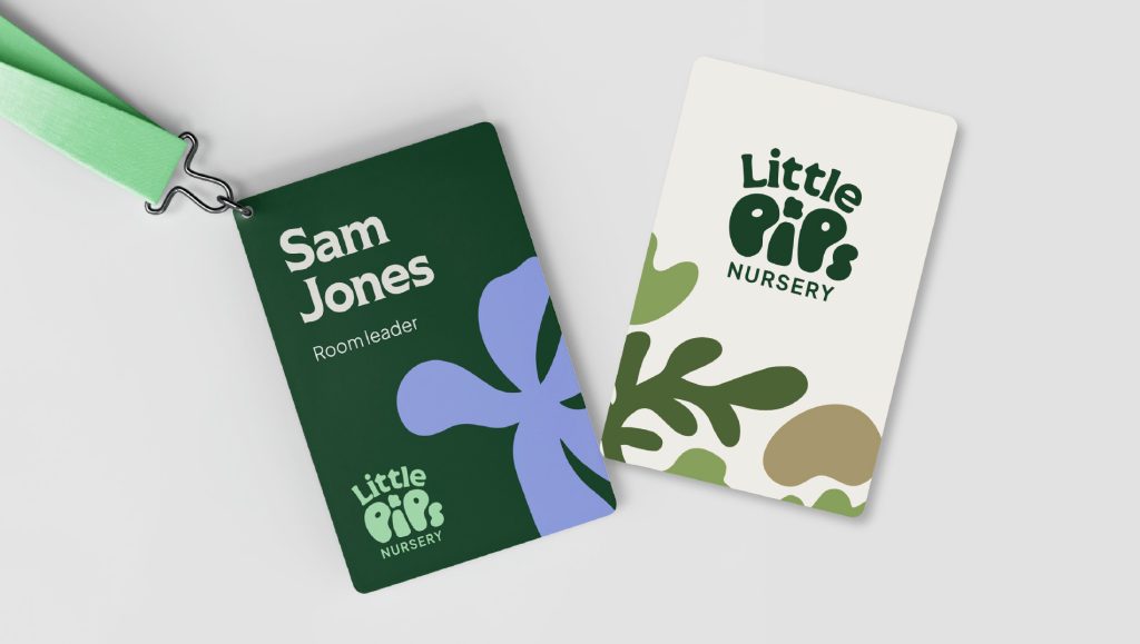
The brand needed to balance warmth, professionalism, and trust while maintaining a distinct identity. Inspired by nature and growth, it uses fluid, organic shapes and a palette of greens, blues, and purples—symbolising tranquility, sophistication, and a connection to Pocklington School’s heritage. Natural patterns and close-up imagery of hands and expressive faces highlight sensory creativity and human connection.
The result is a brand that feels both premium and personal—reflecting the care, expertise, and charisma that make Little Pips special. By blending a nurturing philosophy with strong educational foundations, it establishes Little Pips as a place where children grow, explore, and thrive.
